
A3 by Incept Medical
Partnering with Incept Medical, I led UX efforts for A3, a desktop application designed to streamline prescription monitoring for medical professionals. I worked closely with the development team and advisory board on research, workflows, and UI design to help providers access critical data in seconds. The goal was to replace slow state systems with a more intuitive and dependable tool.
Role: UX Research, Wireframes, Prototypes, and UI
Tools: Sketch, Zeplin, Firebase, Illustrator
Leadership Perspective:
“Josiah was a key contributor to the success of A3. He brought clarity to a very complex product, translating technical workflows into a clean, intuitive interface that our team could build quickly and confidently. His ability to balance UX strategy, thoughtful collaboration, and developer-ready design made every phase of the project smoother. Having worked with him across several products, I can say he consistently raises the bar for both design quality and team efficiency.”
- Ethan Bonin
Principal Developer at Incept Medical (now CTO, Prahsys Inc.)
⚡️TL;DR
A3 is a prescription compliance platform used by healthcare and pharmacy teams to evaluate controlled substance activity, identify risk patterns, and support regulatory reporting. The challenge was to modernize a complex desktop workflow into a clearer, more usable experience without compromising accuracy, compliance, or trust in the data.
I led the UX and UI design end to end, working across research, information architecture, interaction design, and visual design. The work focused on streamlining high-volume workflows, organizing dense prescription data, and making risk indicators immediately understandable for non-technical users. This included designing core evaluation flows, dashboards, and developer-ready UI components within a highly regulated environment.
The result is a clearer, more efficient desktop application that reduces cognitive load for critical review tasks, improves scanability of complex data sets, and establishes a scalable design foundation for future feature expansion and compliance needs.
Deliverables & Scope
End-to-end desktop application redesign
Core evaluation and review workflows
Risk classification and severity indicators
Data-dense tables and dashboards
Design system components and UI patterns
Developer-ready handoff and specifications
The Challenge
State Prescription Monitoring Programs (PMPs) were slow, outdated, and difficult to navigate, creating real obstacles in a high stakes clinical environment. Providers waited minutes for reports to load, sifted through cluttered interfaces, and struggled to spot critical risk indicators buried in dense data tables. These issues didn’t just slow workflows — they increased the chance of missing important history that could impact patient safety, compliance, and responsible prescribing. A3 needed to deliver a faster, clearer, and more dependable way to access this information exactly when it mattered most.
Project Goals
Reduce the time required to retrieve and review prescription history reports.
Provide a clear, intuitive interface that minimizes cognitive load.
Surface patient risk indicators in a consistent, clinically useful way.
Support compliance while improving workflow efficiency.
Research & Insights
To understand how medical professionals accessed prescription history data, I reviewed prior research conducted with dentists and DEA agents and supplemented it with new interviews. Across all sessions, the same issues came up: slow report retrieval, overwhelming interfaces, unclear compliance cues, and difficulty locating critical risk indicators during high-stakes moments.
These findings highlighted that existing state PMP platforms were not just inconvenient — they created friction in clinical workflows and added unnecessary stress for providers trying to make safe, compliant prescribing decisions. The research also reinforced the need for a system that could integrate cleanly with state databases and present long, complex patient histories in a structured, digestible format.
From this research, the team focused on improving:
• Speed and reliability to reduce multi-minute query times
• Information clarity to surface compliance details and risk factors at a glance
• Workflow efficiency through simplified navigation and reduced cognitive load
• Data organization to break down long prescription histories into readable segments
• Low-friction onboarding to help clinicians get started quickly
• Seamless database integration to ensure accurate, up-to-date reporting
Together, these findings made it clear that A3 needed to eliminate friction at every step, giving medical professionals a system that delivers fast, accurate, and confidently actionable prescription data.
Design Approach
To build a system that medical professionals could trust in high stakes situations, I focused on designing clear workflows, reducing cognitive load, and making complex prescription data easy to interpret. Partnering closely with Incept Medical’s development team and advisory board, I translated clinical needs into an interface that felt fast, structured, and dependable.
Core Design Priorities
1. Workflow Mapping
I mapped out how dentists, physicians, and DEA agents accessed prescription history across different states. These maps informed a streamlined flow that cut multi minute retrieval down to seconds and ensured every action supported compliance.
2. Information Architecture
Long, dense prescription histories were reorganized into clear, digestible sections. Risk indicators, prescriber history, and prescription timelines were structured so providers could scan key details without searching through cluttered tables.
3. Risk Indicator System
I designed a visual system that surfaced high risk behaviors through consistent color coding, iconography, and summary tiles. This made it easier for clinicians to identify red flag patterns quickly and confidently.
4. Developer Ready UI
I translated workflows into wireframes, prototypes, and a structured component library that aligned tightly with engineering needs. This ensured smooth handoff, faster implementation, and visual consistency across the platform.
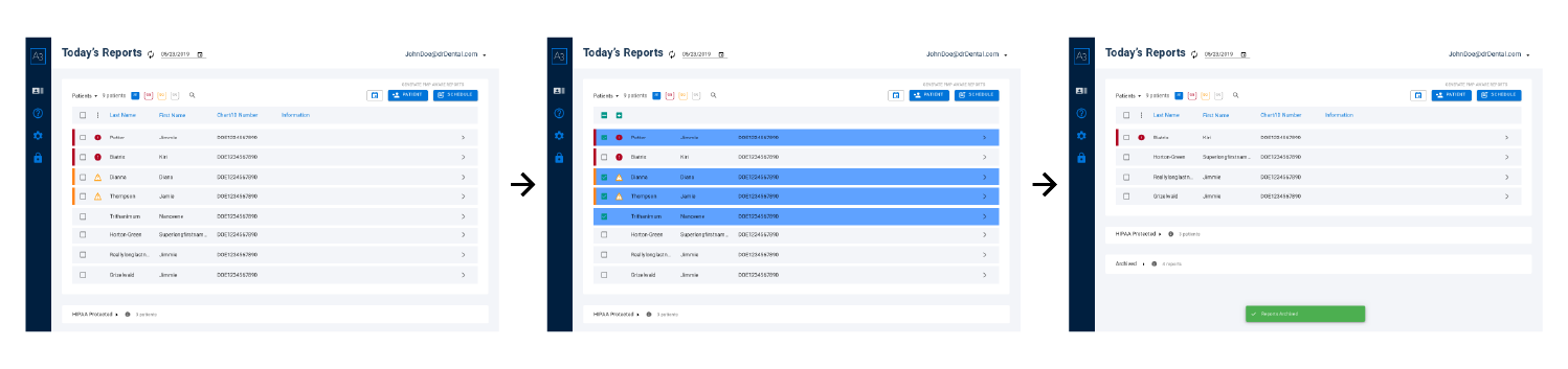
1. Streamlining Workflows
State PMP systems required multiple steps and long wait times to retrieve a single patient report, creating stress for providers who needed quick, compliant decisions. Interviews with clinicians highlighted how unpredictable and time-consuming this process felt in real clinical settings.
Working with the development team, I mapped the end-to-end workflow and removed unnecessary steps. We automated manual queries, simplified navigation, and designed a linear flow that made each stage clear and predictable. The updated experience retrieves reports automatically and organizes results in a clean “Today’s Reports” dashboard.
Key Improvements:
• Automated retrieval replaced multi-step manual querying
• Fewer actions and clearer guidance reduced cognitive load
• Status indicators kept users oriented throughout the process
These changes turned a multi-minute, uncertain process into a fast, reliable workflow clinicians could trust.
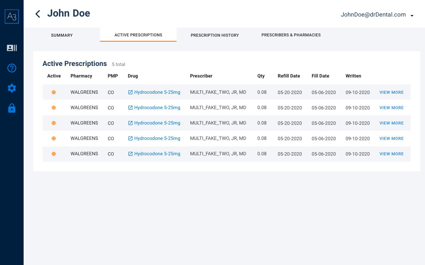
2. Organizing Complex Prescription Data
Clinicians often described prescription histories as overwhelming to review. Reports were long, inconsistent between states, and filled with dense tables that made it difficult to find core information like dates, prescribers, quantities, or refill patterns. Even simple tasks—like confirming when a medication was last dispensed—required scanning through multiple screens.
To fix this, I reorganized A3’s patient data into a clear, predictable structure. Instead of one long scrolling table, the information was grouped into logical sections such as patient summary, prescription history, prescribers, and pharmacies. Each section used consistent layouts, spacing, and hierarchy so clinicians always knew where to look. The result was a calmer, more readable interface that reduced cognitive load and helped providers work faster.
Key Improvements
• Long prescription histories separated into clean, labeled categories
• Consistent table layouts and typography for easier scanning
• Predictable section structure so clinicians always knew where to find information
These updates transformed scattered data into an organized and readable medical record, allowing clinicians to move through reports with greater speed and confidence.
Structured Clinical Summary: Surfacing key prescriptions, alerts, and risk cues in one place.

Risk Scale and Severity Indicators: Color coded summaries to clarify urgency at a glance.
Detailed Prescription Tables: Supporting information organized into clean, predictable categories.
3. Making Risk Indicators Instantly Understandable
Clinicians stressed that high-risk prescribing patterns were easy to miss because they blended into long tables or appeared without context. Important cues—like multiple prescribers, early refills, or unusually high dosages—required scanning dense text to interpret, which slowed decisions in high-pressure moments.
To address this, I designed a unified risk-indicator system that made urgency unmistakable. A3 introduced a clear color-coded scale for low, caution, and high risk, paired with consistent iconography and concise summaries explaining why a patient triggered a particular level. These visual cues were placed at the top of each patient report so clinicians could understand severity immediately before diving into the detailed history.
Key Improvements
• Color-coded severity levels to communicate risk at a glance
• Simple, consistent iconography for fast visual recognition
• Clear “reason for risk score” summaries to provide immediate clinical context
These changes created a shared visual language for patient safety, helping clinicians identify red-flag behaviors faster and act with greater confidence.
4. Delivering Developer-Ready UI
Because A3 was being built from the ground up, the engineering team needed a UI foundation that was consistent, predictable, and fast to implement. Early prototypes revealed that even small inconsistencies in spacing, layout, or interaction patterns slowed development and created unnecessary rework.
To support a smooth build, I created a modular component library that unified typography, spacing, table patterns, and interaction behaviors across the platform. Each component included clear states, error handling, and usage rules so engineers could assemble screens quickly without guessing how elements should behave. I collaborated closely with the dev team during sprints to identify edge cases, refine patterns, and ensure feasibility without compromising usability.
Key Improvements
• Reusable components standardized the interface and reduced visual drift
• Clear documentation for states, behaviors, and patterns sped up development
• Close collaboration with engineers kept the product scalable and technically feasible
This foundation allowed the team to ship features faster, maintain quality across screens, and build a platform that could scale as A3 expanded into new workflows and additional states.
Brand Kit
Color branding had already been decided upon by the time I joined the team, but I still explored styles with the existing wireframes and began building the A3 design system which evolved as I continued to jam out the design bits throughout the lifecycle of this project.
End-to-End Desktop Application
The design continued to evolve and the UI of the A3 experience came to life. As promised, here is another link to the finished prototype.
Impact and Next Steps
User testing focused on evaluating critical workflows such as retrieving patient reports and analyzing risk scores. Test participants provided valuable feedback on usability, particularly around the clarity of risk indicators and the ease of navigating large data sets. Observations revealed that users struggled with locating specific reports quickly, leading to the implementation of a robust search functionality. Additionally, testers highlighted the need for workflow enhancements, such as the ability to mark patients as completed, which helped streamline repetitive tasks. This iterative feedback loop ensured that every update was grounded in real-world usability concerns, enhancing the overall efficiency and user satisfaction of the platform.
From Feedback to Functionality
Next Steps
Future efforts include expanding A3’s user base to include a wider range of medical professionals beyond dental practitioners. This involves targeted outreach and onboarding strategies tailored to specific specialties. Additionally, broader testing will be conducted in diverse environments to gather comprehensive feedback, ensuring the product meets varying needs while maintaining patient confidentiality. Continued development will focus on refining the platform's features, enhancing scalability, and integrating advanced analytics to further support compliance and usability across the medical industry.
Lessons Learned
This project taught me the importance of setting clear expectations upfront, fostering empathy for users and stakeholders, and leveraging third-party testing platforms to gather actionable insights. It allowed me to refine my ability to manage complex workflows, enhance collaboration, and deepen my understanding of medical software design in a highly regulated environment.
You’ve Made it to the end!
Thanks for reviewing my work. If you’re evaluating designers for a contract or full time role, my resume has additional context.
Let’s Chat!
I’m always open to new projects, collaborations, and conversations. Whether you’re exploring a full-time role, a contract engagement, or just want to talk through an idea, feel free to reach out.
Based in Seattle, WA
Your information is only used to respond to your message.