Text Me That
Designing a low-friction SMS reminder system used at scale with 85% month-over-month retention.
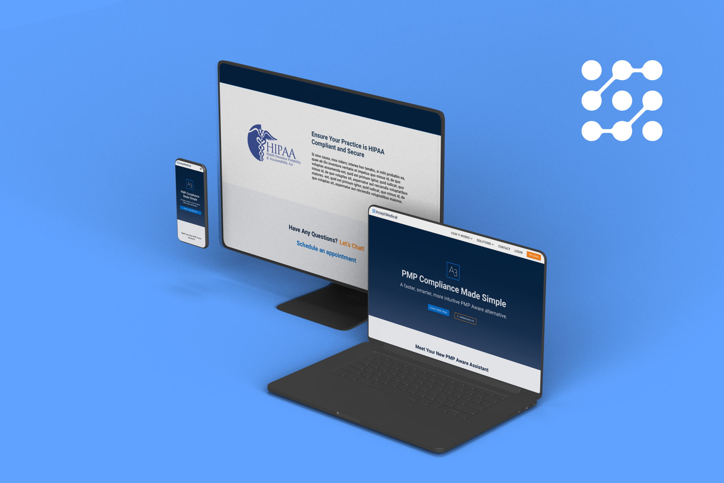
Text Me That is an iOS mobile app that uses SMS reminders to help people stay on top of what matters most—like taking medications on time. During research, we discovered that many users relied on the app for managing prescriptions, an insight that inspired new features to support that use case. The redesign focused on simplifying scheduling, adding group and location-based reminders, and creating a more approachable interface.
Role
UX Research & UI Design
Tools
Adobe XD, Zeplin, Firebase, Illustrator, Photoshop
Leadership Perspective:
“Josiah was instrumental in the redesign and successful relaunch of Text Me That. He combines strong UX strategy with technical precision, transforming the app’s usability and visual identity. His ability to align design goals with development needs made the entire process faster and more cohesive — a rare blend of creativity and execution.”
- Ethan Bonin
Owner & Developer, Text Me That (now CTO, Prahsys Inc.)
⚡️TL;DR
Designed and shipped core reminder creation and scheduling flows for an SMS-based productivity app
Reduced reminder setup friction from minutes to seconds
Prioritized speed, reliability, and repeat use over feature depth
Shipped improvements supporting 100K+ SMS messages per month
Contributed to 85% month-over-month user retention
Partnered closely with engineering across multiple shipped iterations
Deliverables & Scope
100K
Monthly SMS
1.3k
Ratings
4.8★
App Rating
Live
Shipped to App Store
The Problem
Traditional reminder and productivity tools fail when users forget to open them. Notifications are easy to ignore, and complex task managers require ongoing engagement to be effective. Text Me That set out to remove the need for app engagement entirely by delivering reminders directly via SMS.
Project constraints:
SMS delivery has a direct cost per message
Any added friction would reduce repeat use
Unnecessary configuration would hurt both retention and margins
Design Goals
Reduce reminder setup time to support fast, repeat use.
Improve readability and accessibility, particularly for older users.
Support essential scheduling use cases without adding cognitive load.
Modernize the visual system while preserving simplicity and user trust.
Skip the case study?
Text Me That is live — experience it now on the Apple App Store.
Research & Insights
To understand how people used text-based reminders in their daily routines, I tested reminder creation and scheduling flows with users and iterated based on observed behavior and feedback. While reminders are simple in concept, testing revealed that many existing tools made them easy to overlook or unnecessarily complex.
Push notifications often blended into background noise, while SMS reminders felt immediate and difficult to miss. This validated Text Me That’s core advantage and reinforced the importance of delivering reminders outside the app itself.
An important insight emerged as users relied on the app for medication schedules and refill reminders. While not the app’s original focus, this highlighted the need for a dependable, low-friction experience where clarity and reliability were critical.
Across testing and real-world usage, several patterns became clear:
Users expected reminder setup to be fast and straightforward
Reliability and clarity mattered more than advanced configuration
Flexibility was valuable only when it did not increase cognitive load
Clear visual confirmation helped build trust that reminders were saved correctly
These insights directly informed the UX decisions that followed, prioritizing simplicity, reliability, and repeat use over feature depth.
Design Approach

Early Validation & Design Direction
Early ideation was informed by usability testing, observed competitive patterns, and iteration on live product behavior. While reminder apps are simple in concept, validation consistently showed that many felt cluttered or easy to ignore. Push notifications often blended into background noise, while SMS reminders felt more personal and immediate, reinforcing the importance of delivering reminders outside the app itself.
Low- and high-fidelity prototypes were used to validate a streamlined reminder creation flow. Validation emphasized the need for fast setup and clear confirmation, while revealing that additional scheduling options only worked when they did not introduce extra cognitive load.
As the product matured, visual refinements focused on readability, accessibility, and trust. Improvements included increased contrast, larger touch targets, and a calmer visual rhythm. The interface adopted a warmer, more conversational tone to reinforce reliability and reduce anxiety around whether reminders were saved correctly.
These explorations established a clear direction: prioritize speed, clarity, and dependability, introducing flexibility only when it did not compromise simplicity.
Key UX Decision: One-Screen Reminder Creation
The problem
Early testing revealed that even small amounts of friction during reminder setup significantly reduced repeat use. Multi-step flows, secondary screens, and optional configuration introduced hesitation, especially for users relying on reminders for time-sensitive or high-stakes tasks like medication schedules.
Because reminders were delivered via SMS, users expected the creation experience to feel just as immediate and reliable as the message itself.
The decision
We consolidated reminder creation into a single, focused screen that allowed users to enter a message, choose timing, and save with minimal interaction. Defaults handled common cases, while advanced options were progressively disclosed only when needed.
The goal was not to remove flexibility, but to ensure it never interfered with speed or clarity.
Why this mattered
SMS delivery introduced real operational costs and raised the stakes for usability errors. Any unnecessary configuration increased both cognitive load and the likelihood of mistakes. By reducing reminder creation to a single screen, we minimized decision fatigue and reinforced trust that reminders were saved correctly.
This approach supported fast, repeat use while keeping the experience approachable for less technical or older users.
The impact
The simplified flow reduced setup time from minutes to seconds and supported frequent, repeat usage. Post-release usage showed sustained engagement, contributing to over 100K SMS messages sent per month and sustained month-over-month retention.
Key UX Decision #2: Defaults Over Configuration
The problem
While users valued flexibility in scheduling, testing showed that too many upfront choices slowed reminder creation and increased hesitation. Exposing all options early made a simple task feel more complex than necessary, especially for users creating quick or recurring reminders.
The decision
We prioritized sensible defaults for the most common reminder scenarios, allowing users to create reminders quickly without making unnecessary decisions. Additional configuration options were available, but surfaced progressively and only when relevant.
Why this mattered
Defaults reduced cognitive load and decision fatigue, helping users move from intent to action with minimal friction. By minimizing upfront choices, the experience remained fast and approachable while still supporting more complex scheduling needs when required.
The impact
This approach supported faster reminder creation and reinforced repeat use, contributing to sustained engagement without sacrificing flexibility for users who needed it.
Key UX Decision #3: Visual Confirmation and Trust
The problem
Because reminders were often used for important or time-sensitive tasks, users needed confidence that actions were completed correctly. Unclear states or subtle feedback created anxiety around whether reminders were actually saved, especially when the app itself was not revisited frequently.
The decision
We emphasized clear visual confirmation throughout the reminder flow, using distinct states, readable hierarchy, and immediate feedback to confirm successful actions. The interface was designed to feel calm and dependable, reinforcing trust without requiring extra steps or notifications.
Why this mattered
When users rely on reminders they may not see again until delivery, trust in the system becomes critical. Clear confirmation reduced uncertainty and reinforced confidence that reminders would be delivered as expected, supporting long-term adoption and repeat use.
The impact
Stronger confirmation and clarity improved user confidence and reduced hesitation during setup, reinforcing reliable behavior patterns and supporting sustained engagement over time.
Insights to Implementation
Early concepts were iterated quickly to validate layout, hierarchy, and interaction patterns. As the product evolved, designs were refined to support faster setup, clearer confirmation, and dependable repeat use.
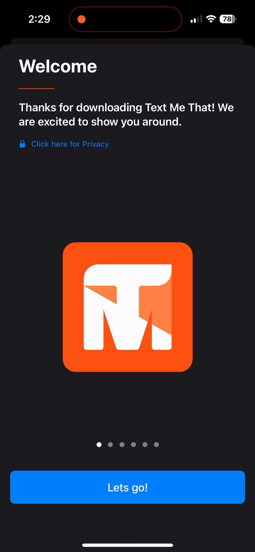
Onboarding
Onboarding was designed to be minimal and focused, helping users create their first reminder quickly without introducing unnecessary steps or configuration.
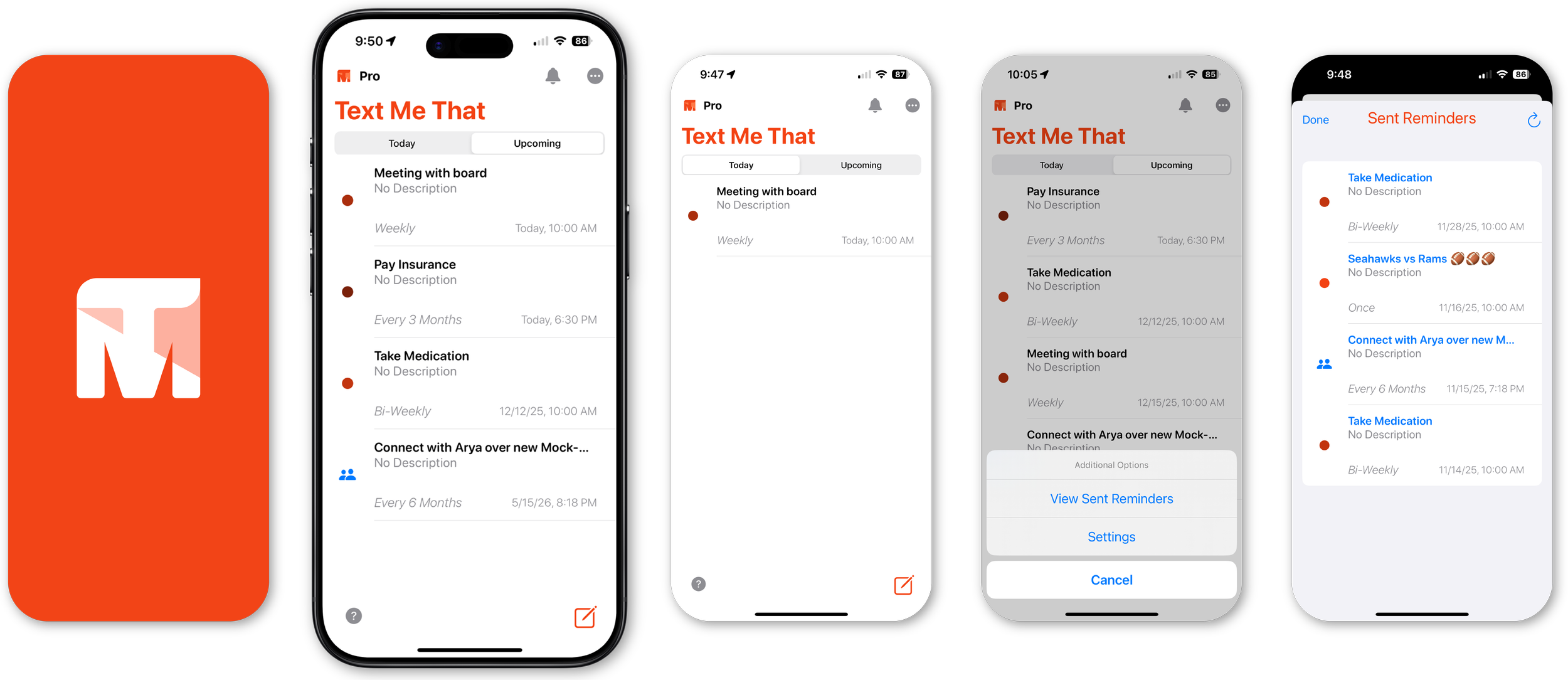
Reminder Features
Additional reminder options such as recurring schedules, location-based triggers, and group reminders are available when needed, without interrupting the core creation flow.
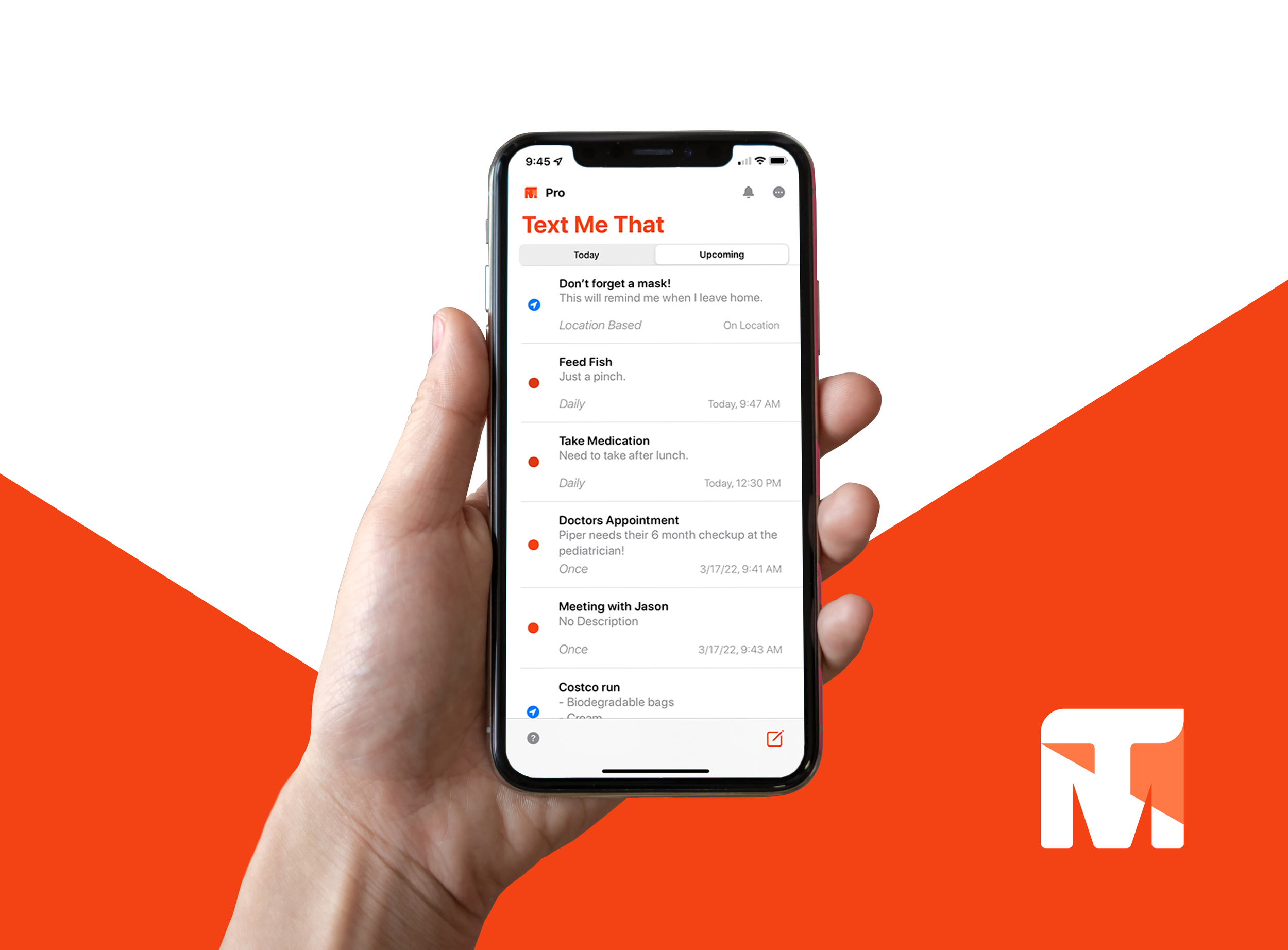
Reminder List (Dashboard)
The reminder list prioritizes readability and status clarity, allowing users to quickly scan upcoming reminders and confirm timing at a glance.
Product Page
Supporting marketing surfaces were designed to clearly communicate the product’s value and build trust prior to signup.
Validation & Refinement
Ongoing testing and iteration focused on improving reliability, clarity, and reducing friction across core reminder workflows.
Simplified reminder setup based on observed hesitation and drop-off
Improved visual hierarchy and confirmation states to reinforce trust
Refined copy and spacing to support readability and accessibility
Iterated on edge cases related to recurring and time-sensitive reminders
Outcome
100K+ SMS messages sent per month
85% month-over-month user retention
50% trial-to-paid conversion following onboarding improvements
4.8★ App Store rating across 1.3K+ reviews
Next Steps
If the product were continued, future exploration would focus on:
Smarter batching and delivery strategies to reduce SMS costs
Lightweight personalization without increasing setup complexity
Lessons Learned
Throughout the evolution of Text Me That, a few themes consistently shaped both the product and how I think about design.
Text reminders meet users where they already are.
Delivering reminders via SMS removed the need for users to remember to open an app, making follow-through feel more natural and reliable.
Simplicity matters more than flexibility.
Features like recurring schedules, location triggers, and group reminders only worked when they were easy to understand and quick to set up. Reducing friction proved more valuable than adding options.
Trust is built through clarity, not cleverness.
Clear explanations around permissions, location use, and confirmation states helped users feel confident that the app was doing what they expected, especially for important or time-sensitive reminders.
These lessons reinforced the importance of designing with empathy and restraint, and how small decisions around clarity and focus can turn a simple tool into something people rely on day-to-day.

Thanks for reading! Text Me That is live and ready to try —
download it on the Apple App Store to see it in action.